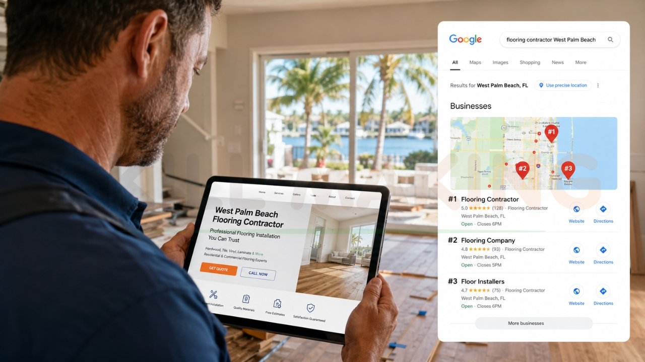
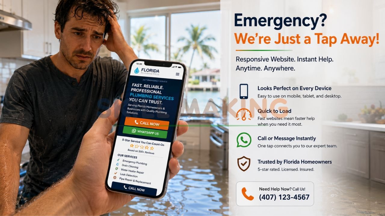
Imagine a customer in Tampa, Florida, standing in two inches of water because a pipe just burst. They aren’t going to pull out a laptop; they are reaching for their smartphone to find a plumber immediately. If your website looks like a cluttered mess on their screen or forces them to pinch and zoom just to find your “Call Now” button, you’ve lost that job before it even started.
In 2026, the digital landscape is dominated by mobility. Recent data shows that over 70%—and in some trade industries, up to 80%—of local searches happen on mobile devices. Google has fully leaned into this reality with mobile-first indexing, meaning the mobile version of your site is now the primary version used for ranking. This is where responsive web design becomes the most critical asset for your small business.
👉 Get a Professional Responsive Website That Looks Perfect on Every Device – 📲 WhatsApp Us Today
This guide will break down everything you need to know about responsive design, why it matters more than ever in 2026, and how Skillmaking can help you build a digital presence that converts.
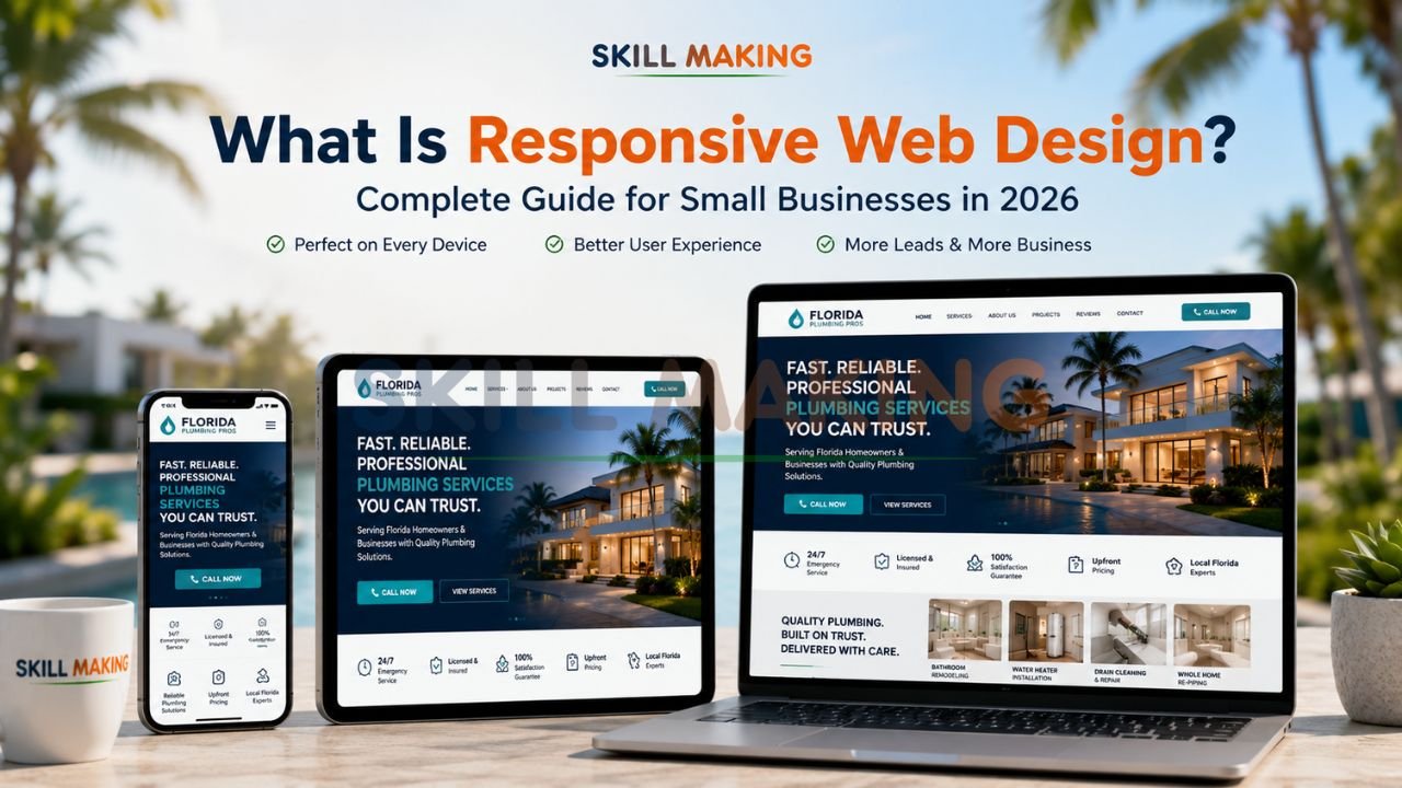
What Is Responsive Web Design?
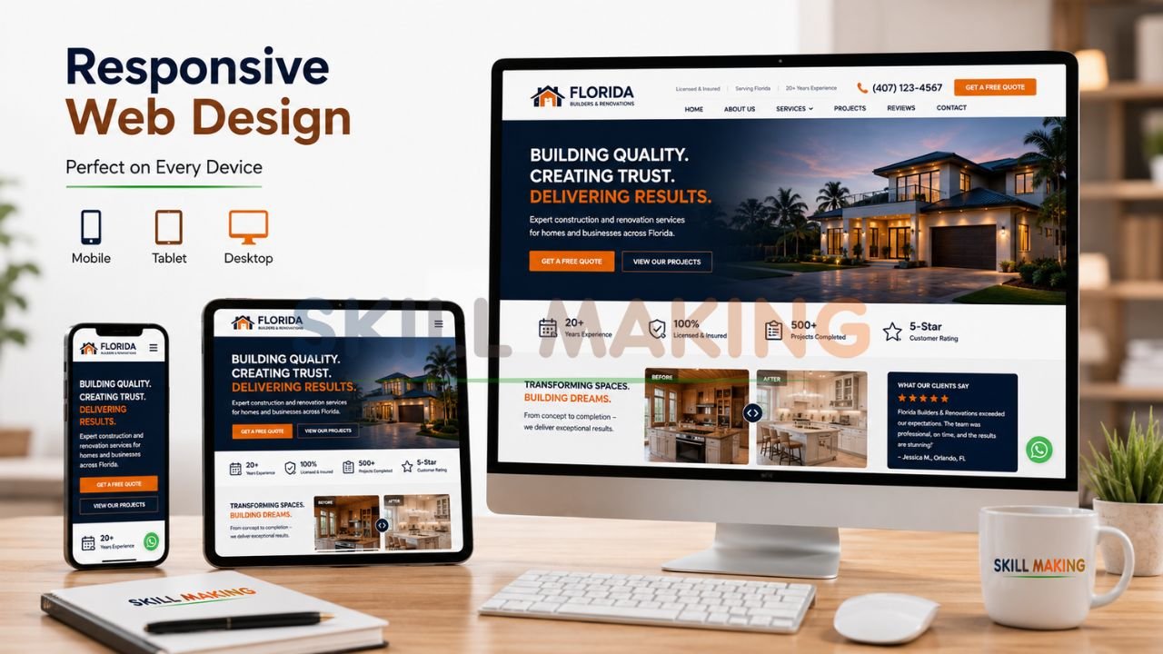
At its core, responsive web design is a web development approach that ensures a website’s layout, images, and functionalities “respond” or adapt to the user’s device and screen size. Whether someone is viewing your site on a massive 30-inch desktop monitor, a tablet, or a compact smartphone, the content remains clear, readable, and easy to navigate.
A Brief History
The term was first coined by Ethan Marcotte in 2010 in an article for A List Apart. Before this, businesses often had to build separate “mobile sites” (often hosted on a subdomain like m.yourwebsite.com). These were difficult to maintain and often provided a stripped-down, inferior experience. Responsive design changed the game by allowing one single website to serve all users perfectly.
Today, organizations like the World Wide Web Consortium (W3C) continue to refine the standards that keep the web accessible and functional for everyone.
How Responsive Web Design Works?
Responsive design isn’t magic; it’s built on three technical pillars that work together to create a seamless experience.
👉 Stop Losing Mobile Visitors Because of an Outdated Website Design – 📲 Start Chat Now
- Fluid Grids: Instead of designing in fixed pixels (e.g., “this box is 500 pixels wide”), designers use relative units like percentages. This allows elements to shrink or expand proportionally based on the screen width.
- Flexible Images: Images are coded with a “max-width” of 100%. This ensures they never overflow their container or become distorted, maintaining their aspect ratio regardless of the device.
- Media Queries: Think of these as the “brain” of the website. They are snippets of code that detect the device’s resolution and apply specific CSS rules. For example, a media query might tell the site to show three columns of text on a desktop but stack them into a single column on a smartphone for better readability.
Responsive vs. Adaptive vs. Mobile-First Design
While these terms are often used interchangeably, they represent different strategies for handling mobile traffic.
| Feature | Responsive Design | Adaptive Design | Mobile-First Design |
|---|---|---|---|
| Method | Fluid; layout changes constantly as screen size shifts. | Uses fixed layouts for specific “break-points” (e.g., iPhone 15 size). | Designing for mobile first, then scaling up to desktop. |
| Maintenance | Low; one site to update. | Higher; multiple versions to manage. | Low; same as responsive. |
| Performance | Excellent; adjusts to any device. | Good; but can feel “jumpy” between sizes. | Top-tier; optimized for the most common user base. |
| SEO Impact | Preferred by Google. | Can be complex for SEO. | Best for 2026 ranking factors. |
In 2026, professional responsive web design by Skillmaking typically utilizes a mobile-first approach to ensure that the majority of your traffic gets the fastest, most intuitive experience possible.
Major Benefits of Responsive Web Design for Small Businesses
Investing in a responsive site isn’t just about looking “modern”; it’s a strategic move to improve your bottom line.
👉 Build a Mobile-First Website That Converts Visitors into Real Customers – 📲 Contact Us on WhatsApp
1. Superior User Experience (UX)
According to the Nielsen Norman Group, user experience is the primary driver of digital success. If your site is easy to use on a phone, users stay longer. If it’s frustrating, they bounce. A high bounce rate signals to Google that your site isn’t helpful, which can tank your rankings.
2. Improved SEO and Visibility
Google has explicitly stated that responsive web design is their recommended configuration for mobile-optimized websites. One URL for all devices makes it easier for Google’s bots to crawl and index your content, which is a foundational layer of Mozlow’s hierarchy of SEO needs.
3. Cost-Effective Management
Managing two separate websites (one for desktop and one for mobile) is a nightmare for small business owners. With a responsive site, you update a photo or a service price once, and it reflects everywhere instantly.
4. Higher Conversion Rates
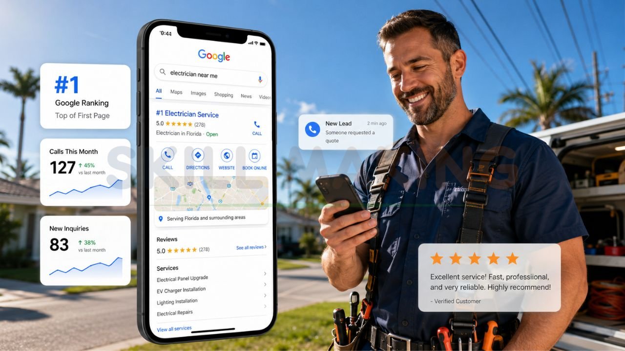
A mobile-friendly web design removes friction. When a customer can click a “Call Now” button that is “sticky” at the top of their phone screen, they are significantly more likely to reach out. Skillmaking clients have seen an average 312% increase in qualified leads within six months of launching a responsive, SEO-optimized platform.
👉 Get a Fast, SEO-Optimized Responsive Website Designed for Business Growth – 📲 Message Us Today
Why Responsive Design Is Critical for Local Businesses?
For local service providers—like those in the construction, flooring, or roofing industries—responsive design is a survival necessity.
- Construction Firms: 75% of potential clients judge a company’s credibility based on their website design. If you are bidding on a high-value project, developers will check your site on their tablets at the job site.
- Home Improvement: Homeowners often browse for kitchen remodeling or flooring ideas on their phones while relaxing on the couch. High-resolution, responsive galleries allow them to see your craftsmanship in detail.
- Emergency Services: As mentioned, plumbers and electricians get the majority of their leads from mobile “emergency” searches. If your site doesn’t load in under 3 seconds on a 3G/4G signal, that lead is going to your competitor.
To learn more about how to capture these types of high-intent customers, read our guide on how to get more home improvement leads.
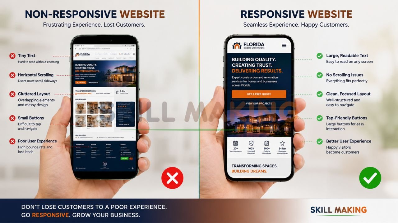
Common Responsive Web Design Mistakes to Avoid
Even with the best intentions, many businesses fall into traps that hurt their performance.
👉 Dominate Google Search with a Lightning-Fast Responsive Website – 📲 Talk to Experts Now
- Tiny Touch Targets: Buttons and links must be large enough to be clicked by a thumb. Small, cramped links lead to “miss-clicks” and user frustration.
- Slow-Loading Images: High-resolution project photos are great, but if they aren’t optimized, they will crawl on a mobile connection.
- Hidden Content on Mobile: Don’t hide important information (like your license number or safety record) from mobile users. They need those trust signals just as much as desktop users.
- Ignoring the Map Pack: A responsive site is only half the battle. You must also integrate with your Google Business Profile to appear in local search results.
For more tips on avoiding digital pitfalls, check out our article on avoiding common marketing mistakes construction companies make. Understanding what marketing is in the construction industry can also help you align your website with your broader business goals.
Key Elements of a Great Responsive Website in 2026
To stay ahead of the competition in 2026, your website needs more than just a fluid layout. It needs:
- Lightning-Fast Loading: Aim for a load time of under 2 seconds. Google’s “Test My Site” tools often flag sites that take longer as “Poor” performers.
- Sticky Navigation: Key buttons like “Get a Quote” or “Call Now” should stay visible as the user scrolls.
- Accessible Typography: Use fonts that are legible on small screens. Standard body text should be at least 16px to avoid straining the user’s eyes.
- Instant Communication Tools: Integration with WhatsApp or live chat allows for rapid lead capture.
- Security: An SSL certificate is no longer optional; it is a basic trust and ranking factor.
Checklist: Is Your Website Truly Responsive?
- Does the layout adjust seamlessly when you resize your browser window?
- Is the text readable without zooming?
- Are all buttons and links easy to tap with a finger?
- Does the site load in under 3 seconds on a mobile data connection?
- Is the “Call” button clickable and easy to find?
- Are all images clear and not distorted on small screens?
👉 Upgrade to a Modern Responsive Website That Works Seamlessly on Mobile & Desktop – 📲 WhatsApp Our Team Now
How Much Does a Responsive Website Cost?
The cost of a responsive website in Florida varies based on the complexity and the results you expect.
- Starter Sites ($1,500 – $3,000): Best for new solo contractors who need a professional digital business card and basic lead capture.
- Professional Corporate Sites ($3,500 – $7,500): Designed for growing firms. Includes deep local SEO for multiple cities, custom service pages, and advanced portfolios.
- Premium Developer Portals ($8,000 – $15,000+): Full-scale digital assets with features like cost estimators, virtual tours, and comprehensive market dominance.
Remember, a professional website is an investment. For a typical plumber, just 12 new customers can pay for the entire investment, making every lead after that pure profit.
How Skillmaking Builds High-Performance Responsive Websites?
At Skillmaking, we don’t just build “pretty” websites. We build lead-generation machines tailored for the trades. Our process is designed to be hands-off for you, so you can focus on your crew and your clients.
- Strategic Audit: We analyze your current digital footprint and your competitors’ strategies.
- Mobile-First Construction: We design your site from the smartphone up, ensuring peak performance where 80% of your leads are.
- Hyper-Local SEO: we optimize your content for the specific Florida cities and neighborhoods you serve.
- Conversion Optimization: We integrate “Call Now” buttons, WhatsApp links, and frictionless bid forms to maximize your ROI.
- Ongoing Support: We provide 24/7 support and training to ensure your site remains a high-value asset for years to only.
Get a fully responsive website for your business today and see why our clients grow their organic traffic by an average of 3.8x within six months.
Conclusion: Take the Next Step Toward Growth
In 2026, your website is often the first—and sometimes the only—impression a customer has of your business. If that impression is a frustrating, non-responsive experience, you are essentially handing your leads to the competition.
Responsive web design is no longer a “nice-to-have” luxury; it is the foundation of modern small business marketing. It ensures you are visible, credible, and reachable, no matter how or where your customers are searching.
Don’t let your craftsmanship be hidden behind an outdated digital wall. Whether you are wiring homes in Miami, repairing roofs in Tampa, or installing luxury floors in Orlando, your digital presence should reflect your professional excellence.
Ready to transform your business with a site that actually works?
Stop losing jobs to competitors with better websites. Partner with the experts at Skillmaking to build your digital powerhouse.
- Explore our services: Professional Responsive Web Design by Skillmaking
- WhatsApp Us Now: +91-7906334941
- Visit Us: https://skillmaking.com
Contact Skillmaking today for a free design consultation and start winning more jobs in 2026.
Frequently Asked Questions
- Does responsive design affect my Google ranking?
Yes. Google uses mobile-first indexing, meaning it primarily uses the mobile version of your content for indexing and ranking. - Can I just use a “mobile plugin” on my old site?
Plugins can offer a temporary fix, but they often result in slow speeds and a “clunky” user experience. A natively responsive design is always superior for long-term SEO and conversion. - Will a responsive site make my page load slower?
If built correctly, no. However, unoptimized images can slow down any site. Skillmaking uses advanced optimization techniques to ensure lightning-fast speeds. - Is responsive design the same as a mobile app?
No. A responsive website is accessed via a web browser (like Chrome or Safari). A mobile app must be downloaded from an app store. For most small businesses, a responsive website is much more cost-effective and reaches a wider audience. - Do I need a different URL for my mobile site?
No. One of the biggest advantages of responsive design is that you use the same URL for all devices, which is great for brand consistency and SEO. - How do I know if my current site is mobile-friendly?
You can use the Google Developers Mobile-Friendly Test to get an instant report on your site’s performance. - Can I update a responsive site myself?
Yes. Skillmaking builds sites on user-friendly platforms like WordPress, allowing you to easily update photos and text without needing to code. - How long does it take to build a responsive website?
A typical high-quality responsive project takes between 4 to 8 weeks, depending on the number of pages and custom features required.