The digital landscape is no longer dominated by the desktop computer. As we move through 2026, the way potential customers interact with your business has fundamentally shifted. In modern markets—especially high-growth sectors like Florida’s $2.145 trillion construction industry—over 60% of all web traffic originates from mobile devices. For a small business owner, this means your website is no longer just a digital brochure; it is a 24/7 sales representative that must perform flawlessly on every screen size, from a massive 4K monitor to a compact smartphone.
The solution to this multi-device reality is responsive web design. But what exactly does that entail, and why has it become the “make or break” factor for business growth? In this comprehensive guide, we will explore the essential nature of responsive websites and why failing to adapt is one of the most expensive mistakes a modern company can make.
👉 Get a Fully Responsive Website That Helps Your Business Rank Higher & Convert More Leads – 📲 WhatsApp Us Today
What Is Responsive Web Design?
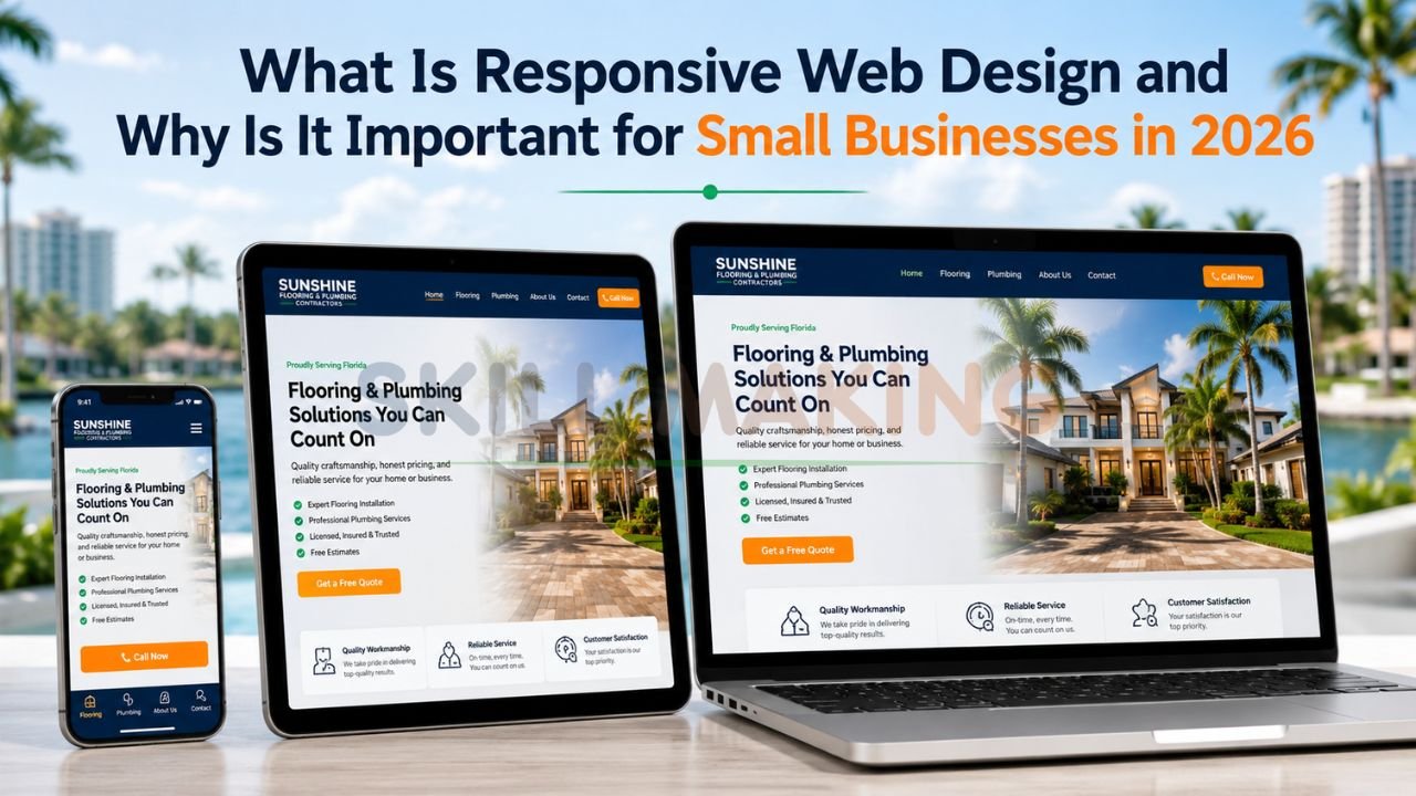
At its core, responsive web design (RWD) is a web development approach that creates dynamic websites which “respond” or adjust their layout based on the screen size and orientation of the device being used. Instead of building multiple versions of a website for different devices, a responsive site uses a single codebase that intelligently reshuffles content to fit the viewer’s screen.
Think of it like water: when you pour water into a cup, it becomes the cup. When you pour it into a bottle, it becomes the bottle. A responsive website behaves the same way. Whether a user is browsing your services on an iPhone in Orlando or reviewing a contract on a laptop in Miami, the experience remains seamless, readable, and professional.
How Responsive Web Design Works?
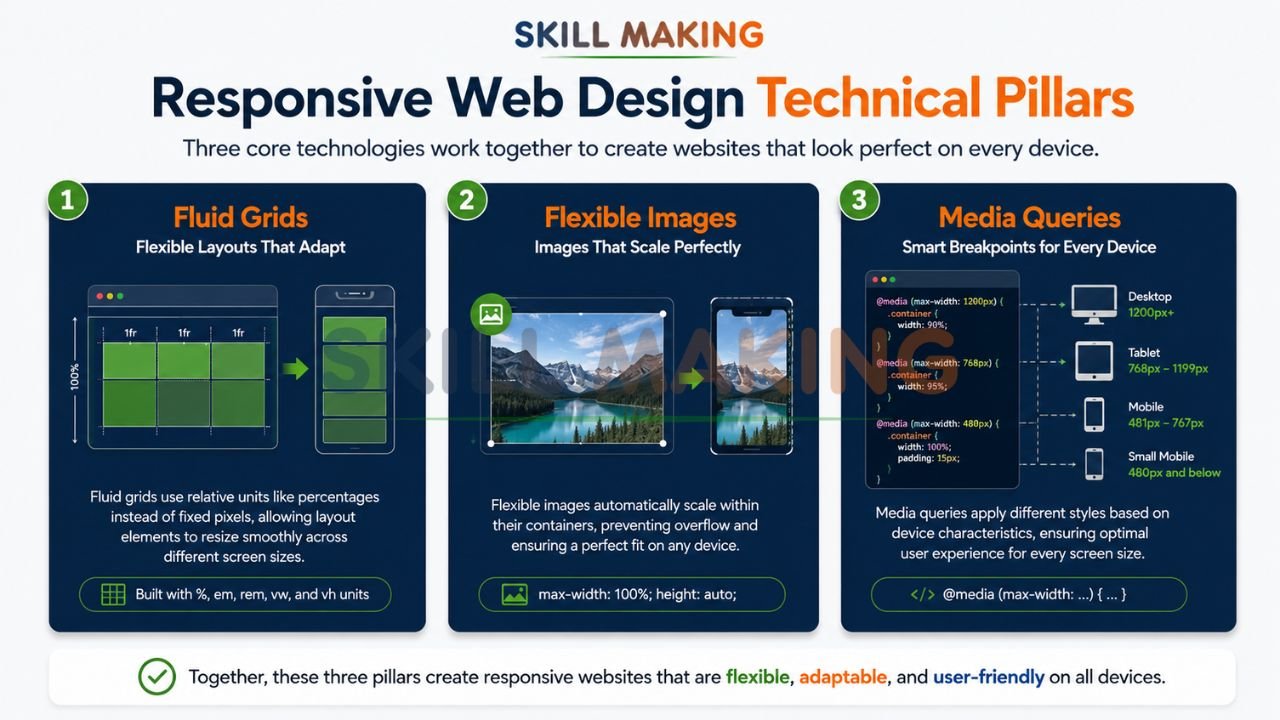
Understanding the “how” behind RWD helps demystify why it is so effective. According to standards set by organizations like the World Wide Web Consortium (W3C), there are three technical pillars that support a responsive site:
👉 Stop Losing Mobile Customers to Competitors with Better Websites – 📲 Start Chat Now
- Fluid Grids: Traditional web design used fixed pixels (e.g., a sidebar exactly 300 pixels wide). Responsive design uses percentages. A column might be set to occupy 25% of the screen, meaning it shrinks or expands proportionally as the browser window changes.
- Flexible Images: Images are coded to never exceed the width of their containing element. This prevents a high-resolution project photo from “breaking” the layout on a mobile screen by bleeding off the edge.
- CSS Media Queries: These are essentially “if-then” statements for your website’s code. For example: “If the screen is narrower than 768 pixels, stack the sidebar underneath the main content instead of beside it.” This ensures that mobile-friendly design isn’t just a shrunken version of a desktop site, but a re-optimized one.
Responsive vs Adaptive vs Mobile-First Design
Business owners often hear these terms used interchangeably, but they represent different strategies:
- Responsive Design: A single site that fluidly changes across all devices. This is the industry standard recommended by Google Developers.
- Adaptive Design: A site that has several fixed layout sizes (e.g., one for desktop, one for tablet). The site detects the device and loads the closest matching layout. While effective, it is harder to maintain than a truly responsive site.
- Mobile-First Design: This is a design philosophy where the mobile version of the site is designed first, and then features are added for larger screens. Given that Google now uses “mobile-first indexing,” this approach is critical for SEO success.
Why Responsive Web Design Is Important in 2026?
In 2026, the importance of a responsive website transcends mere aesthetics; it is a core requirement for technical authority and lead generation. Here is why it is non-negotiable:
1. Google’s Mobile-First Indexing
Google primarily uses the mobile version of a site’s content for indexing and ranking. If your mobile experience is poor, your desktop rankings will suffer. Sites optimized for mobile see a 20–30% improvement in search rankings.
👉 Build a Mobile-First Website Designed for Speed, SEO & Real Business Growth – 📲 Contact Us on WhatsApp
2. The 2-Second Rule
Modern users are impatient. A professional website must load in under 2 seconds to prevent “bounce” (users leaving immediately). Responsive sites, when built correctly, are optimized for speed, which is a major factor in retaining high-intent leads.
3. User Credibility
Research from the Nielsen Norman Group indicates that users judge a company’s credibility within milliseconds of landing on their page. Approximately 75% of users judge a business’s credibility based on its website design alone. If a site is difficult to navigate on a phone, the user assumes the business’s physical work will be equally disorganized.
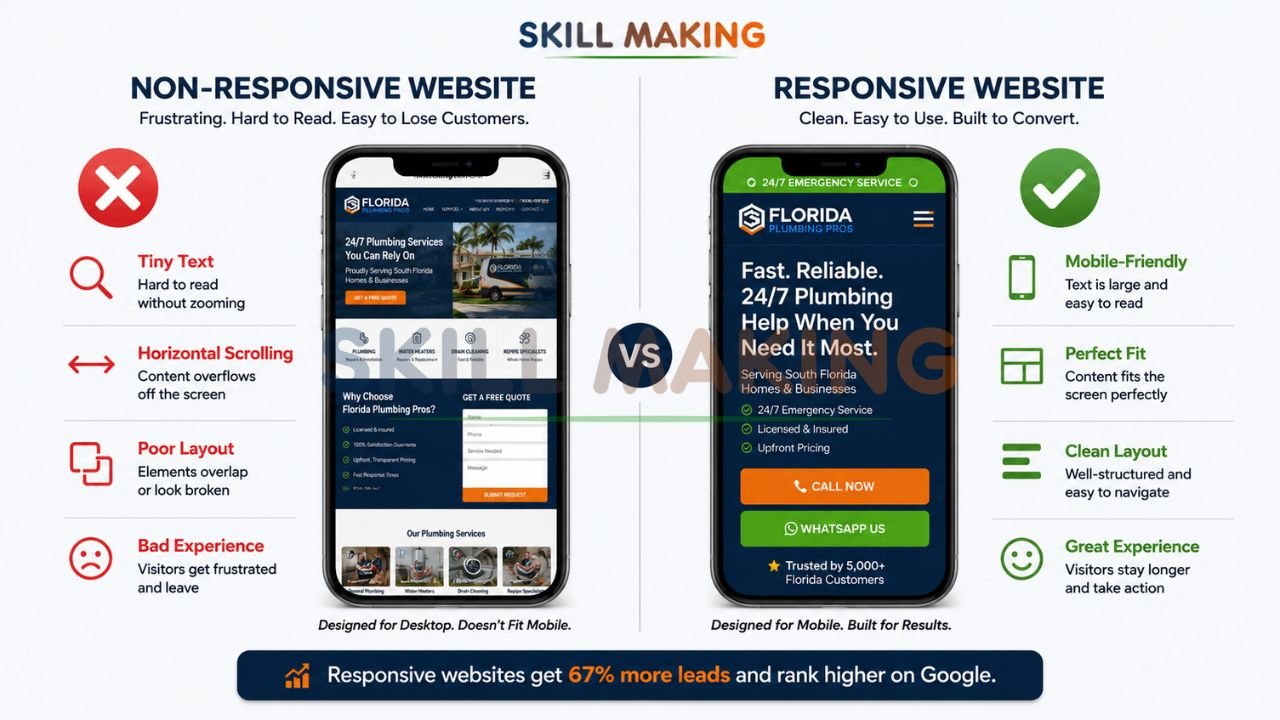
Major Benefits of Responsive Web Design for Small Businesses
Investing in professional responsive web design by Skillmaking offers measurable returns on investment (ROI).
| Feature | Responsive Website | Non-Responsive Website |
|---|---|---|
| User Experience (UX) | Consistent across all devices. | Frustrating; requires “pinch-and-zoom.” |
| SEO Ranking | Boosted by Google’s mobile-first indexing. | Penalized; lower visibility in search results. |
| Maintenance | Single site to update and manage. | Multiple versions require double the work. |
| Conversion Rate | Optimized buttons and forms (20-25% higher). | High friction; leads often “ghost” the site. |
| Bounce Rate | Lower; users stay longer to read content. | Higher; 25% more likely to leave immediately. |
Increased Reach and Sales
By catering to the “on-the-go” audience, you capture leads at the exact moment they are searching for your services. Whether they are looking for a contractor while on a lunch break or browsing home improvement ideas in the evening, a responsive site ensures you are accessible 24/7.
👉 Get a Professional Responsive Website That Works Perfectly on Mobile, Tablet & Desktop – 📲 Message Us Today
Cost-Effectiveness
While the initial investment in a high-quality responsive site might be higher than a template, it saves money in the long run. You only have one site to host, one site to secure, and one site to market. For small businesses, this efficiency is vital for scaling operations without doubling overhead.
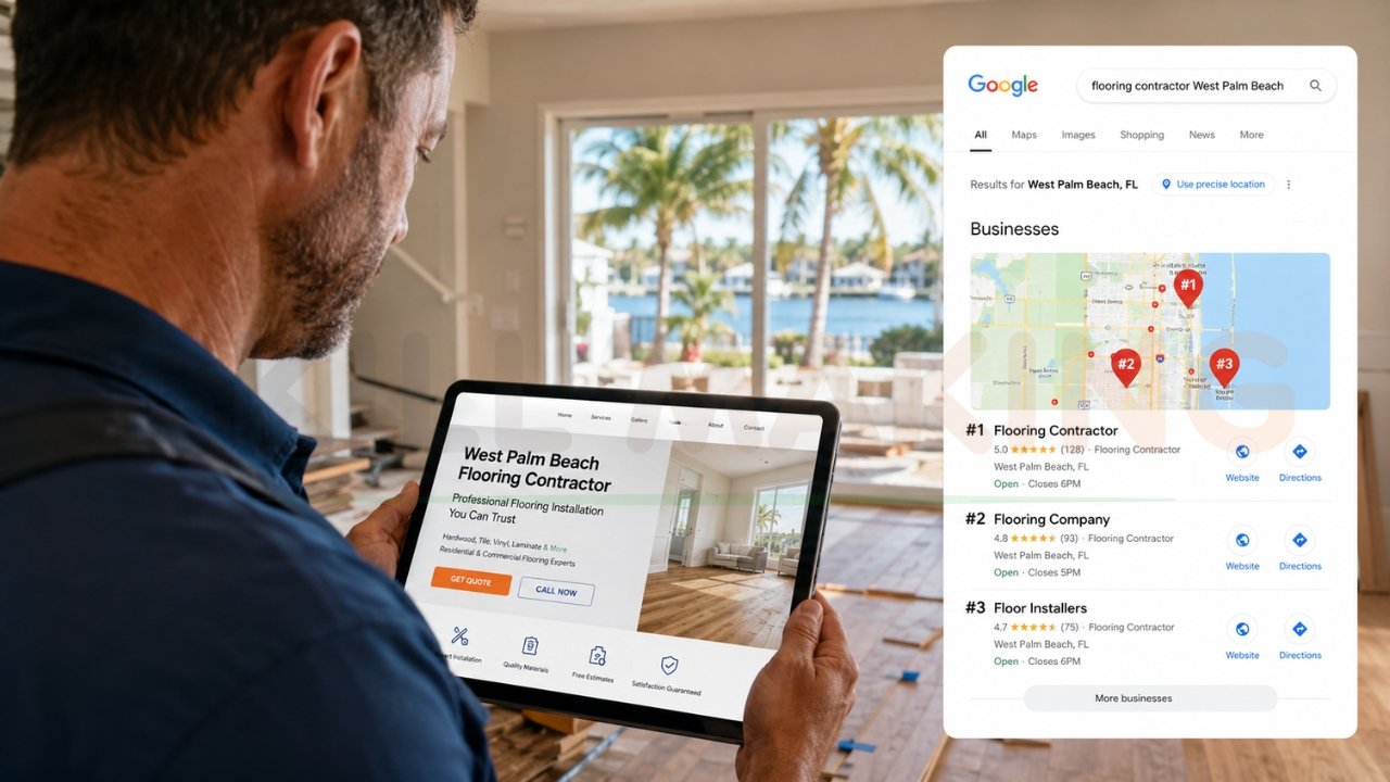
Why Responsive Design Matters for Local Service Businesses?
For contractors, home improvement specialists, and local tradespeople, the stakes are even higher. Local SEO is the engine that drives high-margin contracts.
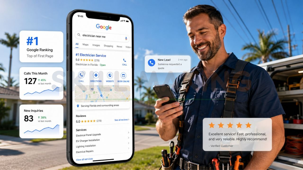
When a developer in Miami searches for “general contractors near me,” Google uses their location and your site’s mobile-friendliness to determine if you appear in the “Local Map Pack”. If your site isn’t responsive, you likely won’t even appear in the top results, regardless of how many years you’ve been in business.
Furthermore, service-based businesses rely on “click-to-call” functionality. A responsive site places your phone number or WhatsApp button front and center, making it easy for a client to contact you instantly. Implementing these features can increase inquiries by 20–30%. To understand how this fits into your broader growth strategy, read more about what is marketing in the construction industry.
The Cost of Ignoring Responsive Design
Ignoring the shift to mobile is not a neutral choice; it actively damages your business.
- Lost Leads: Contractors without an SEO-friendly, responsive website risk losing up to 70% of potential projects to more digitally savvy competitors.
- Damaged Reputation: In a competitive market like Florida, project galleries and testimonials are your proof of work. If those images don’t load properly or are cut off on a phone, you lose the “trust signals” necessary to close a deal.
- Wasteful Ad Spend: If you are running Google Local Services Ads or Facebook Ads, you are paying for clicks. If those clicks land on a non-responsive site that is hard to use, you are essentially throwing your marketing budget away.
Common Responsive Design Mistakes to Avoid
Many businesses attempt to “go mobile” but fall into common traps that hinder their performance.
👉 Get a High-Performance Responsive Website Designed to Grow Your Business Faster – 📲 Contact Our Experts
- Tiny Touch Targets: Buttons that are too close together or too small for a thumb to click. This is a major UX fail that drives users away.
- Slow Load Times: Large, unoptimized images can cripple a mobile site’s speed.
- Hidden Content: Removing important information on the mobile version to “save space.” If it’s important for a desktop user, it’s important for a mobile user.
- Poor Follow-Up Systems: Even a great site can’t fix a business that ignores inquiries. Slow response times are a primary reason why many firms fail to scale. Learn how to avoid common marketing mistakes construction companies make to ensure your new website actually converts.
How to Check If Your Website Is Responsive?
You don’t need to be a developer to test your site. Use these simple methods:
- The Browser Resize Test: On your desktop, open your website. Grab the corner of the browser window and slowly shrink it horizontally. Does the content stack neatly, or do you have to scroll sideways to see everything?
- Google Mobile-Friendly Test: Use free tools provided by Google Search Console to see how Google’s bots “see” your mobile site.
- The “Mom” Test: Ask someone who isn’t tech-savvy to find your “Contact Us” page and fill out a form using only their phone. If they struggle, your potential clients will too.
If you find that your site is lacking, it may be time for a professional responsive web design. For those in the residential sector, discovering how to get more home improvement leads often starts with this fundamental technical upgrade.
Signs Your Website Needs a Responsive Redesign
- Users have to “pinch and zoom” to read text on their phones.
- Your site takes more than 3 seconds to load on a 4G connection.
- Navigation menus are difficult to tap with a thumb.
- Images appear distorted or cut off on smaller screens.
- Your “Bounce Rate” in Google Analytics is higher than 60%.
- You haven’t updated your site’s design since 2022.
How Skillmaking Creates High-Performance Responsive Websites?
At Skillmaking, we don’t just build websites; we build “lead generation machines”. Our approach to responsive web design is rooted in data and industry-specific expertise.
👉 Dominate Google Search with a Fast, SEO-Optimized & Mobile-Friendly Website – 📲 Talk to Experts Now
- Mobile-First Strategy: We design for the smallest screen first to ensure the core message and “Call to Action” are never lost.
- Conversion Optimization: Every site we build includes high-visibility click-to-call buttons and streamlined inquiry forms that work perfectly on mobile.
- Speed as a Priority: We utilize advanced caching and image optimization to ensure your site hits that critical sub-2-second load time.
- Local SEO Integration: We bake city-specific keywords (like Miami, Orlando, or Tampa) into your site’s architecture to help you dominate the local search results.
When you get a fully responsive website for your business through Skillmaking, you aren’t just getting a pretty design—you are securing a competitive advantage in a $2.145 trillion market.
Conclusion
In 2026, a website is no longer a luxury—it is the foundation of your business’s credibility and growth. Responsive web design is the only way to ensure that foundation is solid across the entire digital landscape. From capturing the 60% of users on mobile to satisfying Google’s strict ranking requirements, a responsive site is the most important marketing asset you can own.
Don’t let your business fall behind while your competitors optimize. If your site is currently a “static brochure” that is hard to use on a phone, you are leaving high-margin leads on the table every single day.
Take control of your digital presence today. Contact the experts at Skillmaking to get a fully responsive website for your business that doesn’t just look great, but actually drives results.
Ready to dominate your local market?
Build Your Lead Generation Machine Today with Skillmaking
Frequently Asked Questions
- Is responsive design better than having a separate mobile app?
For most small businesses, yes. A responsive website is easier to maintain, cheaper to build, and much better for SEO. Unless your business requires complex native phone features (like GPS tracking or offline access), a responsive site is the superior choice. - Will a responsive website help my local SEO?
Absolutely. Google uses mobile-friendliness as a ranking signal. A responsive site helps you appear in the “Local Map Pack,” which is where the majority of high-intent local clicks happen. - How much does a responsive website cost?
Costs vary based on the complexity and number of pages. However, it is a one-time investment that replaces the need for multiple site versions, making it the most cost-effective long-term solution. - Can I turn my existing non-responsive site into a responsive one?
In some cases, yes, but it is often more efficient and effective to do a “responsive redesign.” This allows you to update your design, speed, and security all at once. - How long does it take to build a responsive website?
A professional, custom-built responsive site typically takes 4 to 8 weeks, depending on the scope of the project and the speed of content approval. - Does responsive design affect site speed?
If built poorly, yes. If built by experts like Skillmaking, it improves speed by using optimized code and flexible assets that load only what is necessary for the user’s device. - Is responsive design just for smartphones?
No. It covers everything from smartwatches and tablets to “phablets” and massive desktop monitors. It ensures your business looks professional on every current and future device. - Why is HubSpot or Smashing Magazine always talking about this?
Industry leaders like HubSpot and Smashing Magazine emphasize responsive design because the data consistently shows it leads to better user engagement, higher search rankings, and more revenue.