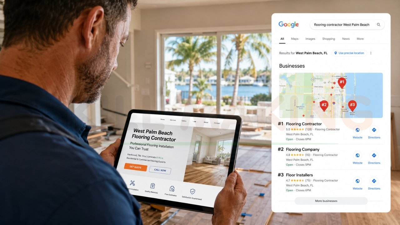
Picture this: It’s the middle of July in Florida. A homeowner’s air conditioning unit suddenly dies. Sweating and stressed, they grab their smartphone, open Google, and search for a local contractor.
Your business pops up first! They click your link.
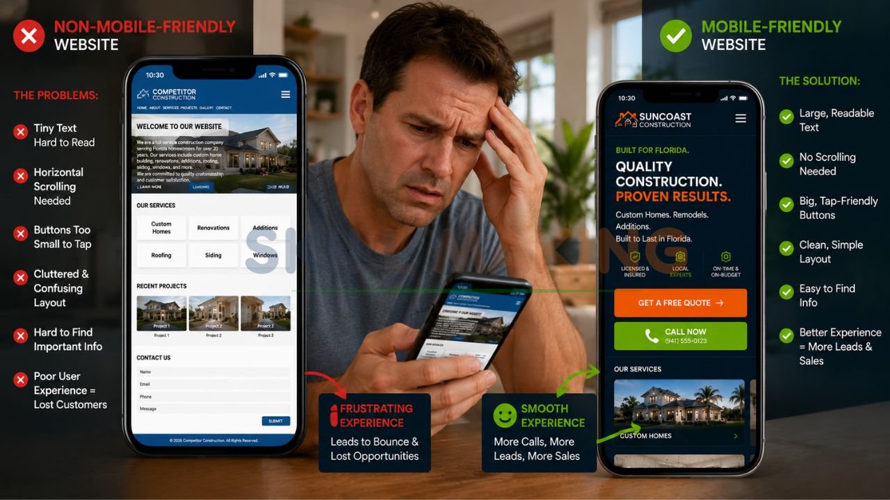
But instead of a clean, easy-to-read page with a big “Call Now” button, they get a tiny, squished version of your desktop site. They have to pinch the screen to read your services. They accidentally tap the wrong link because the buttons are too close together. Frustrated, they hit the “back” button and call your competitor instead.
👉 Get a Mobile-Friendly Website Designed to Bring More Calls, Leads & Customers to Your Business – 📲 WhatsApp Us Today
If you own a business and your website isn’t mobile-friendly yet, this scenario is happening to you right now. You aren’t just losing clicks; you are losing real, paying customers.
In 2026, having a mobile-friendly website design isn’t just a nice bonus—it is the absolute foundation of your online business growth. Let’s break down exactly why it matters, what the current standards are, and how you can turn your website into a mobile lead-generation machine.
What Exactly Is “Mobile-Friendly Website Design” in 2026?
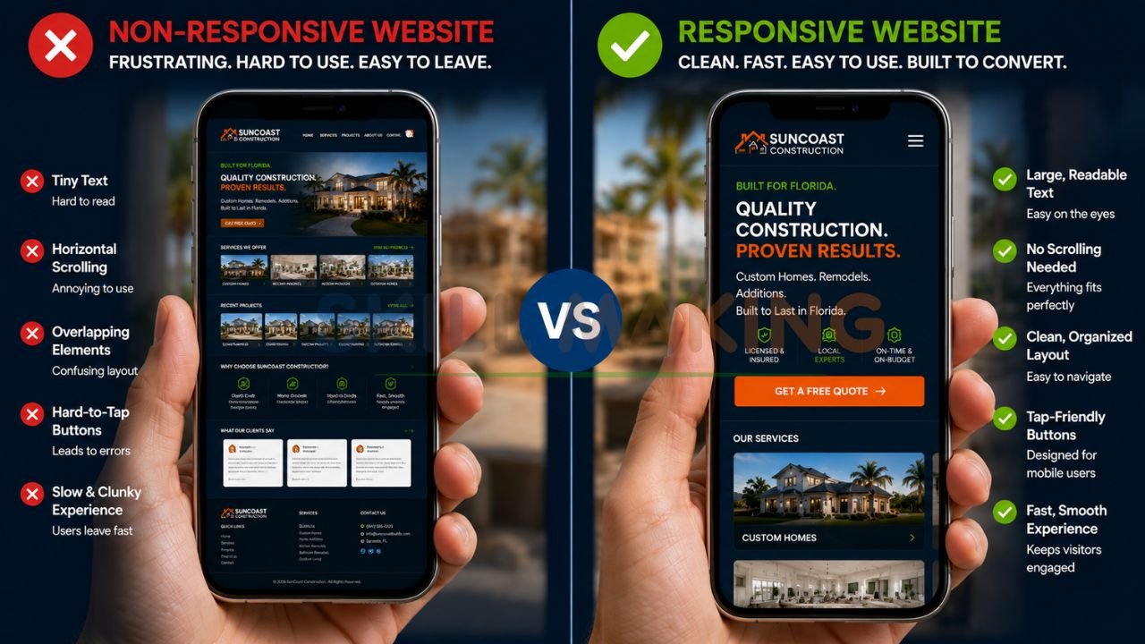
A few years ago, having a “mobile” site meant having a completely separate, watered-down version of your website just for phones. Today, that approach is dead.
In 2026, the gold standard is responsive website design for businesses.
Responsive design means your website automatically “responds” and adapts to whatever screen size the customer is using. Whether they are browsing on a giant 32-inch desktop monitor, an iPad, or the newest iPhone, the website seamlessly shifts its layout. Images resize properly, text becomes perfectly readable without zooming, and menus condense into easy-to-tap icons.
But true mobile-friendliness goes beyond just fitting on the screen. It’s about the user experience (UX). It means pages load instantly on a 5G connection. It means large, thumb-friendly buttons. It means prioritizing the information people actually want when they are on the go.
Why Your Business Can’t Ignore Mobile Users Anymore (The Hard Truth)
If you are still on the fence about upgrading your site, here are the practical, real-world reasons why a mobile-first approach is mandatory for survival today.
👉 Let Skill Making Build a Fast, Responsive Website That Converts Mobile Visitors into Real Leads – 📲 Start Chat Now
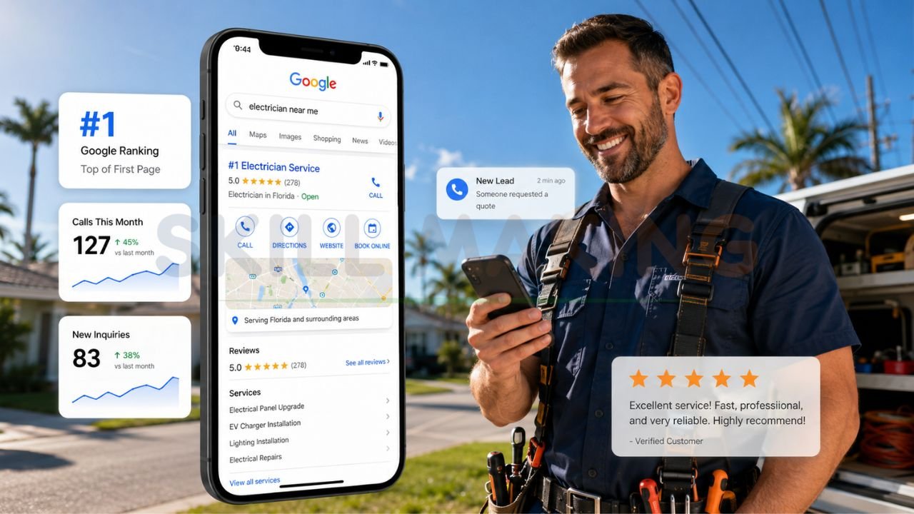
1. Google Judges Your Mobile Site First
Google uses something called “Mobile-First Indexing.” This simply means that when Google decides where to rank your business in search results, it looks almost exclusively at the mobile version of your website. If your mobile site is slow, clunky, or broken, your Google rankings will tank—even if your desktop site is beautiful.
2. The Majority of Local Searches Happen on Phones
Think about your own habits. When you need a nearby restaurant, plumber, or landscaper, you don’t boot up a laptop. You grab your phone. Over 60% of all website traffic now comes from mobile devices, and that number is even higher for local services. If your site doesn’t cater to these users, you are ignoring the majority of your market.
3. Customers Have Zero Patience for Bad Design
Modern consumers expect instant gratification. If your website takes more than three seconds to load on a mobile device, a massive chunk of your visitors will simply leave. They won’t wait. A fast, sleek mobile experience builds immediate trust. A broken one tells the customer, “We don’t pay attention to the details.”
The Cost of Ignoring Mobile Responsiveness for Contractors
For service-based businesses, a bad mobile site directly impacts your bottom line. Let’s look at the specific ways an outdated site hurts your sales.
- Lost Emergency Leads: When people need emergency services, they are in a rush. A professional website design for HVAC in Florida must allow a frantic homeowner to tap one button to call you instantly. If they have to hunt for your phone number, you lose the job.
- Poor Brand Perception: High-ticket services require immense trust. If a homeowner is researching website design for roofing contractors, they expect to see a polished, fast-loading portfolio of your past work. If your site looks like it was built in 2010, they will assume your contracting methods are equally outdated.
- Abandoned Contact Forms: Have you ever tried to fill out a 15-question form on a smartphone? It’s a nightmare. Non-mobile sites often have tiny, hard-to-click form fields that cause potential leads to give up halfway through.
6 Essential Features of a High-Converting Mobile Website
If you want to stop losing leads and start dominating your local market, your mobile website must include these non-negotiable features.
👉 Need More Construction, HVAC, Roofing or Remodeling Leads? Get a Mobile-Optimized Website Today – 📲 Contact Us on WhatsApp
1. Lightning-Fast Load Times
Mobile users are often on cellular data, not high-speed home Wi-Fi. Your site needs to load in a blink. You can achieve this by compressing your images (using modern formats like WebP), minimizing heavy background videos, and upgrading your website hosting.
2. Thumb-Friendly Navigation
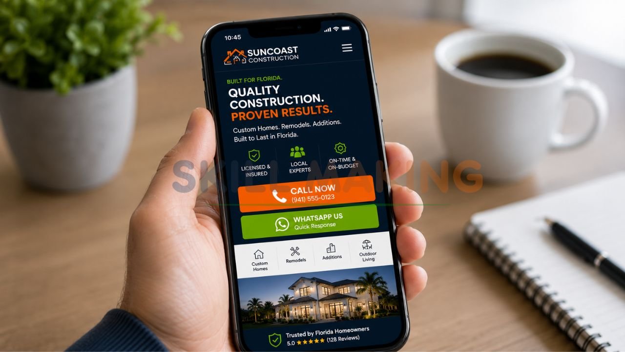
Most people navigate their phones with one hand, using just their thumb. Your most important buttons—like “Get a Quote” or “Call Us”—should be placed in the “thumb zone” (the lower and middle parts of the screen).
3. Click-to-Call Buttons
This is the holy grail for contractors. Your phone number shouldn’t just be plain text. It needs to be a prominent, clickable button. When a customer taps it, their phone should immediately dial your business.
4. Simplified, Painless Forms
Whether you are showing off a remodeling website design development project or offering a free estimate, keep your forms incredibly simple. Ask for the bare minimum: Name, Phone Number, Email, and a brief message. Use large input boxes that easily trigger the phone’s keyboard.
5. High-Contrast, Readable Text
Mobile screens have a lot of glare, especially outside in the bright Florida sun. Make sure your text has high contrast against the background (like dark gray text on a white background). Keep your font size at least 16px so no one has to squint.
6. Clean, Minimalist Galleries
If you are relying on visual proof—such as website design for landscaping contractors to show off a new backyard oasis—your image galleries need to be swipeable. Users naturally want to swipe left and right on their phones to view photos. Don’t make them click tiny “next” arrows.
Common Mobile Web Design Mistakes Hurting Your Sales
Even businesses that think they have a mobile-friendly site often fall into these common traps. Are you making any of these mistakes?
👉 Stop Losing Customers Because of a Slow or Non-Mobile-Friendly Website – 📲 Message Us Today
- Intrusive Pop-Ups: Google actually penalizes websites that use giant pop-ups covering the whole screen on mobile devices. If you must use a pop-up, make it small and easy to close.
- Buttons That Are Too Close Together: We call this “fat-finger syndrome.” If your links or buttons are placed too tightly together, users will constantly click the wrong thing, get annoyed, and leave. Buttons should be at least 44×44 pixels with plenty of space around them.
- Hiding Important Information: Sometimes, in an effort to make a site look clean on mobile, designers will hide crucial service details inside complex menus. Your core services and contact info should always be front and center.
How to Test If Your Website is Truly Mobile-Friendly
You don’t need a degree in computer science to figure out if your website needs work. Here are three incredibly easy, practical ways to test it right now:
Step 1: The Google Mobile-Friendly Test
While Google retired its standalone tool, you can easily use Google Chrome’s built-in “Lighthouse” feature, or check your Google Search Console under the “Mobile Usability” tab. It will directly tell you if elements are too close together or if text is too small.
Step 2: The “Spouse and Friend” Test
Hand your phone to someone who doesn’t use your website every day. Ask them to perform a simple task, like finding your pricing or filling out a contact form. Watch their face. If they squint, sigh, or tap the wrong thing, you have a usability problem.
Step 3: Check Your Own Analytics
Log into Google Analytics and look at your “Bounce Rate” for mobile devices versus desktop. If your mobile bounce rate is significantly higher (meaning people leave immediately without clicking anything), your mobile design is likely driving them away.
👉 Get Responsive Website Design, Local SEO & Conversion-Focused Marketing Services in One Place – 📲 Chat with Us Today
How Skill Making Helps Florida Businesses Dominate on Mobile
At Skill Making, we don’t just build websites that look pretty on a laptop. We engineer high-performance digital assets designed to convert mobile traffic into paying customers.
We understand the unique needs of Florida business owners, contractors, and entrepreneurs. You don’t just need a digital brochure; you need a tool that drives real local leads. That is why construction website design services that win more jobs are our specialty.
Here is exactly what we bring to the table:
- Custom Mobile-First Design: We design for the smartphone screen first, ensuring every button, image, and block of text is perfectly optimized for thumbs and fast scrolling.
- Speed Optimization: We build lightweight, lightning-fast sites that keep impatient customers engaged and make Google’s ranking algorithm happy.
- Hyper-Local SEO: We structure your mobile site so that when someone in your specific Florida city searches for your services, you show up at the top.
- Conversion-Focused Layouts: We place clear, compelling call-to-action buttons exactly where mobile users naturally look and tap.
We take the technical headache completely off your plate so you can focus on what you do best: running your business.
Final Thoughts: Is Your Website Ready for Mobile Users?
We’ve covered a lot of ground today, but the core message is incredibly simple: Your customers are on their phones.
If your website isn’t treating those mobile users like VIPs, you are actively handing your hard-earned leads over to your competitors. A mobile-friendly website design for businesses isn’t a futuristic trend; it is the reality of doing business in 2026.
By investing in responsive design, fast load times, and thumb-friendly navigation, you instantly elevate your brand. You look more professional, you rank higher on Google, and most importantly, you make it ridiculously easy for people to pay you for your services.
Don’t let another hot Florida summer or busy construction season pass by with a website that frustrates your potential customers. It’s time to upgrade your digital storefront.
Ready to get a professional mobile-friendly website design for your business? Call or WhatsApp Skill Making right now at 917906334941 or email us at info@skillmaking.com — we’d love to help you grow your business!
Frequently Asked Questions (FAQ)
Does a mobile-friendly site cost extra?
No, not in 2026. Responsive design is a standard part of any professional web build. If an agency tries to charge you extra to make a site “mobile-friendly,” walk away. At Skill Making, responsiveness is built into the DNA of every site we launch.
Can I just update my old site, or do I need a total rebuild?
It depends on how old your site is. If it was built on ancient code from 10 years ago, trying to force it to be mobile-friendly is like putting a Ferrari engine in a golf cart. It’s often cheaper and much more effective to start fresh with a modern, mobile-first foundation.
How long does it take to see results from a mobile-friendly redesign?
From a user experience standpoint, the results are instant. You’ll likely notice an immediate drop in bounce rates and an uptick in form submissions. From an SEO perspective, Google usually takes a few weeks to re-crawl your new, faster site and adjust your rankings upward.