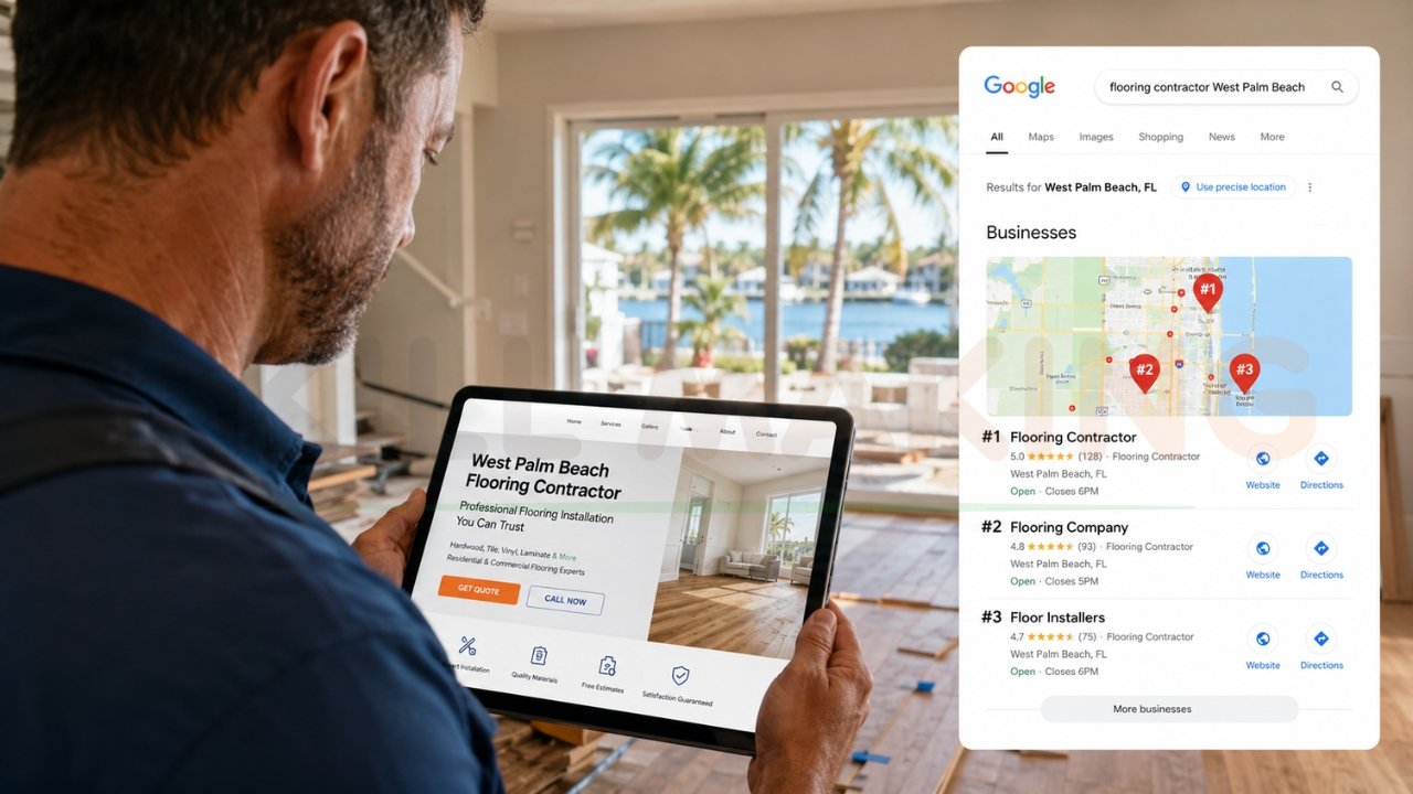
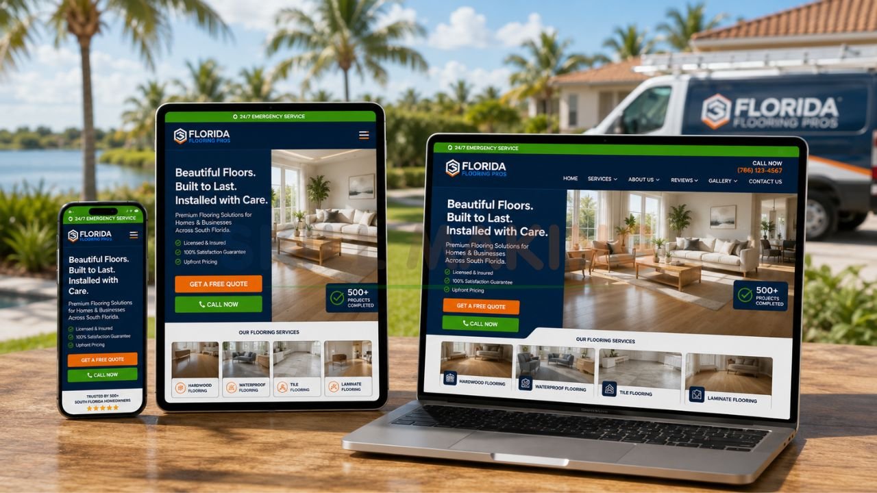
Imagine a potential client in Florida, perhaps an owner of a high-end villa in Miami or a facility manager in Tampa, urgently searching for a contractor during the peak monsoon season. They grab their smartphone—the device that now handles over 80% of local service searches in India and similar volumes globally—and click on your website. If your site doesn’t load correctly, forces them to pinch-and-zoom, or hides the “Contact Us” button, you’ve just handed a lucrative contract to a competitor. In 2026, the stakes are higher than ever: over 90% of construction and home improvement leads begin with an online search, and roughly 75% of users judge a company’s credibility based solely on its website design.
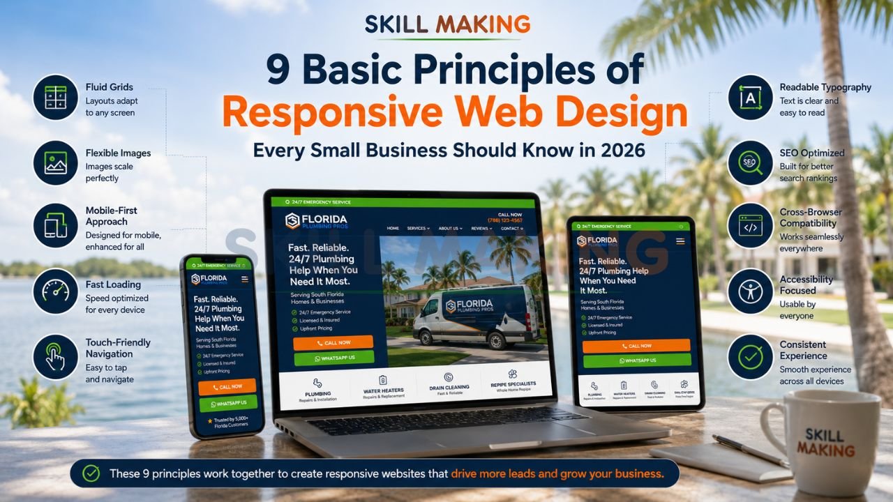
The foundation of modern digital success is a mobile-friendly, high-performance interface. To help you dominate your local market, we have outlined the 9 core principles of responsive web design that every small business owner must understand to remain competitive.
👉 Get a Website Built on the 9 Principles of Responsive Web Design – 📲 WhatsApp Us Today
What Is Responsive Web Design? (Quick Recap)?
Responsive Web Design (RWD) is a design philosophy first popularized by Ethan Marcotte in his seminal article for A List Apart. Instead of building separate websites for desktops, tablets, and smartphones—an unsustainable “zero-sum game”—RWD uses a single site that adapts to the user’s context through fluid grids, flexible images, and CSS media queries. In simple terms, your website “ebbs and flows” naturally to fit any screen size, ensuring a seamless experience for every visitor.
Why the 9 Principles of Responsive Web Design Matter in 2026?
The construction and renovation market is projected to reach $1.4 trillion by 2027 in India alone, and Florida’s construction sector is expected to expand by 7% in 2026. As competition fierces, your digital storefront is no longer a luxury; it is your 24/7 sales representative.
Adhering to these 9 principles of responsive web design ensures:
- Search Engine Dominance: Google prioritizes mobile-first indexing; if your site isn’t responsive, you won’t rank.
- Trust and Authority: Professional designs build immediate trust, especially for high-stakes services like roofing or kitchen remodeling.
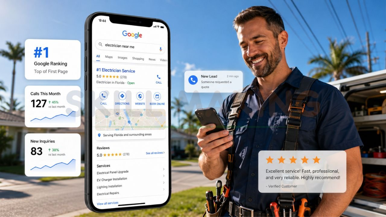
- Higher Conversion Rates: Features like WhatsApp integration and fast loading speeds can lead to a 3x increase in inquiries within 60 days.
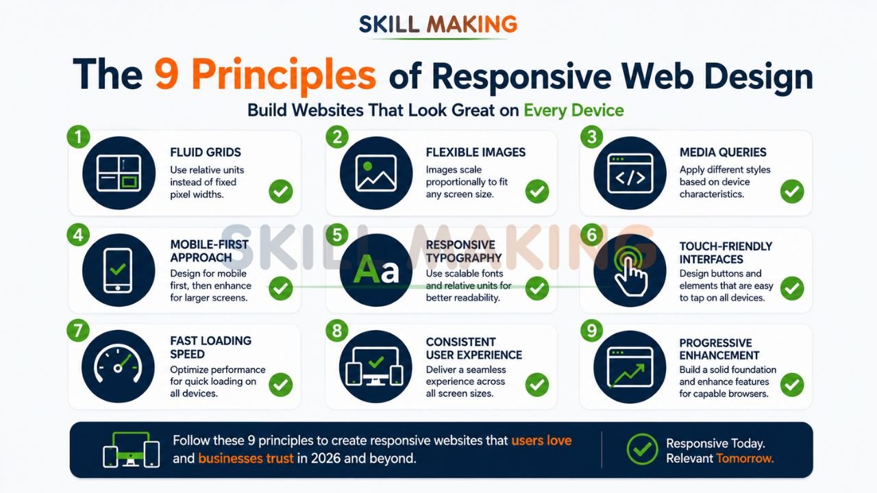
The 9 Basic Principles of Responsive Web Design
👉 Build a Fast, Mobile-Friendly Website That Converts Visitors into Real Leads – 📲 Start Chat Now
Principle 1: Fluid Grid Layouts
Traditional web design relied on “fixed” layouts measured in pixels (px). A fluid grid layout, however, uses relative units like percentages (%). This means your website’s columns and margins resize proportionally to the screen width.
- Why It Matters: A fixed 960px sidebar might look great on a laptop but will extend past the edge of a smartphone screen, causing frustrating horizontal scrolling.
- Best Practice: Design with a flexible grid that scales as the viewport changes, as recommended by W3C standards.
Principle 2: Flexible Images and Media
Images must be just as fluid as the grid they sit in. By using CSS rules like max-width: 100%, images will never grow larger than their containing element, ensuring they shrink to fit smaller screens without losing their aspect ratio.
- Why It Matters: High-resolution project photos of a luxury kitchen or a new roof are critical for “visual proof”. Flexible images ensure these photos look stunning on an iPhone and a widescreen monitor alike.
- Best Practice: Use modern image formats like WebP for faster loading while maintaining high quality.
Principle 3: CSS Media Queries
Media queries are the “brains” of responsive design. They allow developers to inspect the device’s characteristics—like its width or resolution—and apply specific CSS styles only when those conditions are met.
- Why It Matters: You can tell your website to show three columns of services on a desktop but stack them vertically into one column on a phone for better readability.
- Best Practice: Follow Google Developers guidelines by setting breakpoints based on content, not specific device models.
Principle 4: Mobile-First Approach
This principle flips the traditional design process on its head. Instead of designing for a large screen and “stripping away” features for mobile, you start with the smallest screen first. This forces you to prioritize your most important content and calls-to-action.
- Why It Matters: It leads to leaner, faster code and ensures the 80% of your users on smartphones get the best experience.
- Best Practice: Ensure your “Get a Quote” or WhatsApp button is the most prominent feature on the mobile view.
👉 Upgrade Your Website with Mobile-First Responsive Design for Better SEO & Conversions – 📲 Contact Us on WhatsApp
Principle 5: Responsive Typography
Text must be legible regardless of the device. Using relative units like em or rem for font sizes allows text to scale appropriately.
- Why It Matters: A font size that looks perfect on a desktop might be too tiny to read on a mobile device, or a headline might break awkwardly across multiple lines.
- Best Practice: Maintain a line spacing of at least 1.25 for normal text to enhance readability for users on the go.
Principle 6: Touch-Friendly Navigation
Fingers are not as precise as mouse cursors. This principle involves designing buttons and menus that are easy to tap with a thumb.
- Why It Matters: Small, cramped links lead to “mis-taps,” frustrating users who are trying to navigate your portfolio or contact page.
- Best Practice: Buttons should be at least 44×44 pixels, with adequate spacing between them to avoid accidental clicks.
Principle 7: Fast Loading Performance
A slow website is a dead website. According to Nielsen Norman Group, users expect a site to load in under 3 seconds; anything longer leads to high bounce rates.
- Why It Matters: If a client is looking for an “emergency plumber in Orlando” or a “roofer in Chennai” during a storm, they won’t wait for heavy, unoptimized images to load.
- Best Practice: Compress all images and use high-speed hosting to ensure lightning-fast performance.
Principle 8: Consistent User Experience Across Devices
While the layout changes, the brand’s look, feel, and core functionality should remain consistent. A user who visits your site on their laptop at the office should feel an immediate sense of familiarity when they check it again on their phone later that evening.
- Why It Matters: Consistency builds the brand trust necessary for high-value contracts.
- Best Practice: Use a harmonious color scheme and standard logo placement across all viewports.
Principle 9: Progressive Enhancement
This involves building a strong, functional base that works for every user (even on old browsers or slow networks) and then adding “layers” of advanced features for users with modern devices and fast connections.
- Why It Matters: It ensures your business is accessible to everyone, regardless of their technology.
- Best Practice: Ensure your core message and contact forms work perfectly before adding complex animations or 3D visualizations.
👉 Stop Losing High-Value Customers Because of Slow or Poor Mobile Design – 📲 Message Us Today
Summary of the 9 Principles of Responsive Web Design
| Principle | Description | Why It Matters | Best Practice |
|---|---|---|---|
| Fluid Grids | Layouts based on % instead of px. | Adapts to any screen width. | Use flexible margins and columns. |
| Flexible Media | Images that scale within their containers. | Prevents horizontal scrolling. | Use max-width: 100%. |
| Media Queries | Conditional CSS for specific screens. | Customizes the look for mobile/tablet. | Set breakpoints based on content. |
| Mobile-First | Designing for small screens first. | Prioritizes key content and speed. | Start with a 1-column layout. |
| Responsive Type | Scaling font sizes using em/rem. | Ensures legibility on all devices. | Aim for high contrast and spacing. |
| Touch-Friendly | Designing for fingers, not cursors. | Improves mobile navigation ease. | Make buttons at least 44x44px. |
| Fast Loading | Optimized images and code. | Prevents visitor abandonment. | Aim for under 3-second load times. |
| Consistent UX | Unified brand feel across devices. | Builds long-term trust. | Keep colors and logos consistent. |
| Progressive Enh. | Layering features on a solid base. | Ensures universal accessibility. | Focus on core content first. |
How to Apply These 9 Principles to Your Small Business Website?
Building a professional digital storefront requires a strategic approach. If you are a contractor or small business owner, follow these steps:
👉 Get a High-Performance Responsive Website Designed for Real Business Growth – 📲 Connect on WhatsApp
- Define Your Goals: Are you looking to attract residential villa projects or bidding for government industrial contracts?.
- Audit Your Current Site: Check if your site is mobile-friendly using tools from Moz or Google.
- Prioritize Local SEO: Ensure your site ranks for terms like “best painters near me” by using location-specific keywords.
- Integrate Lead Capture: Add prominent WhatsApp buttons and “Request a Quote” forms to convert traffic into leads.
- Focus on Visuals: Use high-resolution, original photos of your work—not stock images—to build social proof.
Common Mistakes That Violate Responsive Design Principles
Many businesses invest in a website only to see zero results because they avoid common marketing mistakes construction companies make. Common pitfalls include:
👉 Build Your High-Converting Digital Foundation with Skillmaking’s Responsive Web Design Services – 📲 Contact Our Experts
- Ignoring Speed: Heavy, unoptimized drone footage can slow a site down to a crawl.
- Hidden Contact Info: If a customer has to hunt for your phone number, they will switch to a competitor.
- Poor Mobile UI: Using tiny links that are impossible to click on a smartphone.
- Generic Content: Failing to define what is marketing in the construction industry and using generic filler instead of technical expertise.
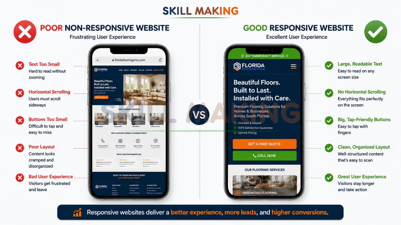
Real-World Examples: Good vs Poor Implementation
- Good Implementation: A roofing company website with a floating WhatsApp button, a “Before & After” gallery that works perfectly on a phone, and a 2-second load time.
- Poor Implementation: A contractor site that looks like a “desktop brochure” shrunk down to fit a phone, where the text is unreadable and the navigation menu is broken.
How Skillmaking Builds Websites Using These 9 Principles?
At Skillmaking, we don’t just build websites; we build lead-generation engines. Whether you are looking for how to get more home improvement leads or need a corporate portal for a large manufacturing firm, our team specializes in high-performance design.
When you choose professional responsive web design by Skillmaking, you get:
- Mobile-First Precision: Every site is optimized for the devices your customers actually use.
- Industry-Specific SEO: We understand the technical nuances of cabinetry, roofing, and civil work, ensuring you rank for the right terms.
- Conversion-Focused Tools: From WhatsApp integration to automated quote forms, we turn browsers into buyers.
- Transparent Pricing: Choose from Starter, Professional, or Premium packages tailored to your business scale.
Conclusion: Start Building Your Digital Future Today
In 2026, the contractors and small businesses winning the most projects are not necessarily those with the best brushes or the newest excavators—they are the ones with the best visibility. Your website is the bridge between your physical craftsmanship and a multi-trillion dollar market.
Don’t let another high-value inquiry go to a competitor just because your site was too slow or non-existent. Get a website built with the 9 principles of responsive design today and watch your business transform into a recognized industry leader.
Ready to grow your leads?
Contact Skillmaking today to build your high-converting digital foundation.
- Website: skillmaking.com/website-design/
- WhatsApp: Person at +91-7906334941
- Email: info@skillmaking.com
Frequently Asked Questions (FAQs)
- Is responsive design really necessary in 2026?
Yes. With over 80% of local searches happening on mobile and Google’s mobile-first indexing, a non-responsive site is effectively invisible to your market. - How much does a responsive website cost in India?
Starter packages typically range from ₹25,000 to ₹45,000, while premium custom solutions for larger firms can range up to ₹1,25,000. - How long does it take to get a responsive site live?
Depending on complexity, a professional site can be delivered in 7 to 25 days. - Can I update my own project gallery?
Yes. Most professional services provide launch training so you can add new projects easily without technical knowledge. - Will my website work on both Android and iPhones?
Absolutely. A site built with the basic principles of responsive design is fully responsive across all operating systems and devices. - What is the most important principle for a local business?
While all 9 are vital, “Fast Loading Performance” and “Touch-Friendly Navigation” are critical for capturing immediate leads from mobile users. - Do I need a website if I already have a Facebook page?
Yes. A Facebook page is a social profile, but a website is a professional asset you own. It provides higher credibility for high-value government or corporate bids. - Is 1 year of free domain and hosting usually included?
Many specialized agencies, including Construction Estimator India and Skillmaking partners, include 1 year of free hosting and domain to simplify the process for small businesses.